You spend 45 minutes picking the perfect outfit for your headshot. The right blazer. The collar that lays flat. The color that flatters your skin tone. Then you sit down, smile, and spend exactly zero seconds thinking about the wall behind your head.
That's the mistake almost everyone makes.
Research by Princeton psychologists Janine Willis and Alexander Todorov found that people form judgments about your trustworthiness, competence, and likability within 100 milliseconds of seeing a face. Your background is part of that split-second read. It shapes the first impression before anyone processes your job title, your smile, or the words in your bio.
Your headshot background is not neutral. It is telling a story about your brand and your industry whether you meant it to or not. The useful part is that once you know what it's saying, you can change it. What follows works the same whether you're booking a photographer, propping up a ring light at home, or using an AI headshot tool like Starkie AI.
Why your background is louder than you think
Your brain doesn't see backgrounds as empty space. It reads them as context.
When someone lands on your profile, their visual system sorts what's behind you into instant categories: corporate, creative, clinical, outdoorsy. This happens before conscious evaluation even starts. A grey seamless backdrop whispers "established professional." A cluttered home office says something very different.
This ties into the halo effect, a bias first described by psychologist Edward Thorndike in 1920. One strong positive signal, like a clean and professional frame, leads viewers to assume other good traits: intelligence, reliability, leadership. Testing across thousands of reviewers showed that upgrading from an amateur, cluttered background to a polished professional one can lift perceived competence by nearly 76%. That's not a rounding error. That's the difference between "hire this person" and "keep scrolling."
Color does heavy lifting here too. One study cited by Capturely found that 62% to 90% of an initial assessment is based on color alone. The tone surrounding your face sets the emotional temperature of the whole image.
So what does each color actually communicate?
Cool neutrals such as grey, slate and navy read as competent and authoritative. Warm neutrals like cream, taupe and warm white feel friendlier and more approachable. Bold saturated colors grab attention, but they tend to overwhelm the face and read as less serious.
Most people default to grey without knowing why. Turns out their instincts are decent. Grey is universally flattering and high-authority. But defaulting is not the same as choosing.

Ignoring all this has a hidden cost. Call it the distraction tax. A busy background literally pulls cognitive attention away from your face. Every plant, outlet, and picture frame behind you competes for the viewer's limited focus. The more your background shouts, the less anyone notices you.
The "right" background isn't universal, though. It depends on where the photo lives.
Platform-by-platform breakdown: what works where
LinkedIn: the tyranny of the tiny circle
LinkedIn is where most professionals need a headshot, and it's also the least forgiving platform for backgrounds. Your beautifully composed photo gets crunched into a circular thumbnail as small as 48x48 pixels in search results, comments, and mobile feeds.
At that size, background detail collapses into mush. If there's low contrast between your hair, shoulders, and the wall behind you, your face blends right into the background and disappears.
The stakes are real. Profiles with a photo get 21x more profile views and up to 36x more messages than photo-less ones. But a photo that vanishes at thumbnail size barely counts.
Pick a high-contrast, single-tone background. Medium grey (around #808080), soft navy, or muted teal all make your face pop even in a tiny avatar. This matters more now than ever, with over 47% of working professionals naming LinkedIn as their main reason for needing a headshot in the first place.
Company team and about pages: consistency beats preference
Team page photos get viewed side by side, in a grid. Here, coherence matters more than any one person's taste. Mismatched backgrounds make a company look fragmented and a little chaotic.
Two approaches dominate. The first is a uniform solid studio background, favored by law firms, consultancies, and financial institutions to signal structure and prestige. Think classic charcoal seamless paper, like Savage's Thunder Gray or Fashion Gray. The second is an on-brand environmental shot, popular with SaaS startups and creative agencies. A softly blurred exposed-brick office communicates culture and openness.
A law firm using charcoal seamless paper and a SaaS startup using warm exposed brick are both making the right call. They're just telling different stories.
Speaker bios and conference programs: lean into authority
Conference websites and event programs often display headshots larger, with room for context. This is where a touch of environment helps. A bookshelf, subtle stage lighting, or a professional setting reinforces subject-matter authority better than a bare backdrop. At bigger display sizes, a plain wall can feel a little empty, while a considered environmental background reads as credible.
Resume portals: keep it conservative
In fields where resume photos are standard, play it safe. Plain white or light grey backgrounds are expected. Bold or vacation-style backgrounds read as unprofessional in finance, law, and medicine. Worth noting: applicant tracking systems don't process your image at all, so the audience here is a human reviewer forming a fast judgment. Give them nothing to trip over.
Social media: your background as a brand asset
Instagram and X have looser rules, but coherence still counts. A background that matches your content palette builds recognition. For creators and solopreneurs, a consistent background becomes part of the brand. People start to recognize your look before they read your name.
Solid, environmental, or blur: head to head
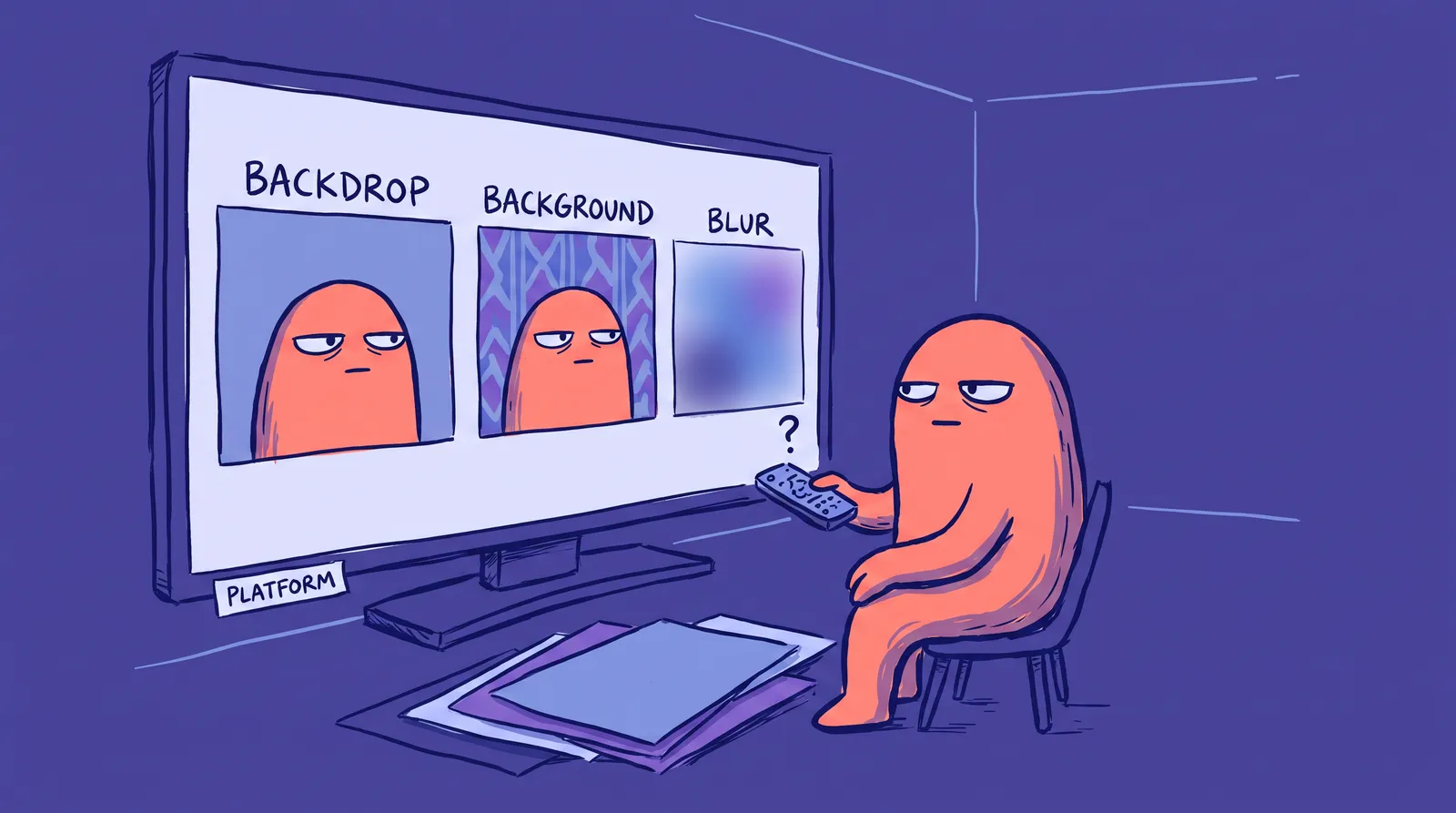
Three background types cover almost every situation. Each has trade-offs.
Solid color or seamless paper is clean, timeless, and works on every platform. It carries no clutter and slots neatly into a team grid. Its weakness is that flat lighting can make it feel sterile. In 2026 the reliable picks are medium grey for general use, soft navy for finance and legal, and warm off-white for healthcare and wellness. Navy is quietly the strongest of those: color marketing studies link it to trust for 74% of participants and competence for 68%.
Environmental backgrounds tell a story instead. A financial advisor in a sleek office, a fitness coach in a gym, an architect with blueprints softly out of focus behind them. They score higher on warmth, and the price you pay is control. Lighting gets harder, visual noise creeps in, and a redecorated office can age the photo within a year.
Blur, whether optical or AI, pulls the eye straight to your face while leaving a hint of context. Not all blur is equal, though. Real optical bokeh from a fast prime lens such as an 85mm f/1.8 looks natural. Aggressive AI blur that eats into your hair and ears looks fake, and it quietly undermines the credibility the photo was supposed to build.
The hybrid path: AI background replacement
AI headshot tools like Starkie AI can place you against a realistic, professionally lit background, which gives you a clean backdrop with studio polish and no equipment to buy or set up. In practice it sits somewhere between the clean solid and the environmental shot.
Need one headshot for multiple platforms? The most versatile choice is a medium-neutral solid color with good lighting, or an AI-generated studio-style background. Both survive the thumbnail crunch and read well at large sizes.
The color psychology layer: How background hues shift perception
Beyond the type of background, the dominant color palette matters enormously. Andrew Elliot and Markus Maier's 2014 review in Annual Review of Psychology documented how color influences psychological functioning across a wide range of contexts. Your headshot background is no exception.
Blue backgrounds are consistently associated with trust, stability, and calm. This is why blue dominates branding in finance, healthcare, and tech. It's why LinkedIn itself is blue. A blue-toned background subtly borrows all of those associations and transfers them to you.
Green backgrounds signal growth, health, and balance. They work well for wellness professionals, sustainability-focused brands, and educators. The connection to nature adds an additional layer of positive association.
Warm tones like amber, soft orange, or terracotta communicate approachability and creative energy. These are increasingly popular for personal brands, coaches, and entrepreneurs who want to stand out from the "corporate blue" sea that dominates most professional platforms.
Neutrals, including gray, white, and black, are the Swiss army knife of backgrounds. They minimize distraction and maximize focus on your face. But nuance matters here. Pure white can feel sterile and clinical. Pure black can feel intimidating or overly dramatic. The sweet spot is often a medium-toned gradient that adds depth without competing for attention.
A practical tip: when using an AI headshot generator, try the same pose with three or four different color backgrounds and show them to two or three trusted colleagues. The "right" color often surprises people. What you assume will perform best rarely matches what others actually respond to.
AI-generated backgrounds in 2026: The contender rewriting the rules
AI-generated headshots have gone from gimmick to mainstream professional tool, used for company bios, resumes, and LinkedIn profiles across industries.
The technology has matured fast. Tools in 2026 use advanced architectures like Flux-based models and customized SDXL pipelines that train specifically on a user's uploaded facial structure, rather than simply pasting a face onto a stock background. The standard "AI tells" from earlier years, weird ear shapes, melted jewelry, impossible shirt collars, have largely vanished. Modern AI headshots handle skin texture, hair detail, and eye reflections with striking accuracy.
The appeal is straightforward. You get the customizable scene and industry context of an environmental portrait with the consistency and cost of a studio shot, typically $20 to $50 per person and under an hour to results. Nothing has to be rescheduled if you want to try again.
That combination matters most for a few groups. Remote workers rarely have a photogenic professional environment to shoot in. Career pivoters often want a background that signals the industry they're moving toward rather than the one they're leaving. International job seekers may need something that reads as culturally neutral. And anyone in a fast-moving industry who updates their photo every quarter can't justify a reshoot each time.
Now, the credibility question. Are AI backgrounds "inauthentic"? Consider this: a headshot is already a curated, lit, retouched artifact of professional presentation. Nobody accuses you of dishonesty for renting a photography studio you don't work in. An AI background that accurately represents your professional context is no less honest than a rented backdrop. The goal is accurate signaling, not documentary realism.
That said, the perception gap is real. A benchmark survey from Ringover found that 76.5% of recruiters preferred AI-generated headshots over real ones in blind tests. Once recruiters knew a headshot was AI-generated, 66% said they'd be put off. The practical conclusion is that the quality has to be high enough that nobody thinks to ask.

With Starkie AI you can generate headshots with custom background environments from a single selfie upload, anything from "modern open-plan tech office" to "outdoor urban architecture" to "neutral executive gradient."
Wardrobe: The colour and fit psychology nobody talks about
Clothing in a headshot communicates two things at once: your industry tribe ("Are you one of us?") and your personal authority spectrum (leader, peer, or creative). Getting either wrong creates a subtle but real trust gap.
Color psychology that actually works
Navy and deep blue signal trustworthiness and calm competence. The International Association of Color Consultants publishes guidelines on how blues promote feelings of safety and stability, which is why navy dominates the bio pages of firms like Goldman Sachs and JP Morgan.
Charcoal and black signal authority, but they can read as cold if the expression doesn't warm them up, so use them deliberately rather than by default. Mid-tone jewel tones such as teal, burgundy and forest green land between the two: confident and a little creative without giving up professionalism. Pantone's seasonal reports have consistently pointed to richer jewel tones as confident, balanced choices.
The colors to avoid are easier to name. White garments tend to blow out against light backgrounds, losing detail and looking cheap. Bright primaries pull attention off the face. Fast-fashion prints date the photo almost immediately.
Fit beats brand, every time
A well-fitted suit from a mid-market brand photographs better than a designer jacket that doesn't sit right on the shoulders. The specific fit signals that read as authoritative are precise: collar sitting flat against the neck, shoulder seams landing exactly at the shoulder bone, and zero fabric bunching around the chest or lapels. When clothing looks like a costume, it erodes trust immediately. Career advisory firm Korn Ferry has emphasized that visible poor tailoring in photos sends a strong signal of inauthenticity.
For AI headshot generators, this means explicit wardrobe input matters. Uploading a reference image of the exact garment style you want is far more reliable than descriptive language alone.

The approachability vs. authority dial
Different industries need different settings on this dial:
In tech, that means smart casual with one button open, a strong accent color, and no tie. A startup CTO in a three-piece suit reads as out of touch. Finance runs the other way: structured, conservative palette, minimal accessories, because a wealth manager in a hoodie reads as reckless. Legal is stricter still, with formal suiting, dark colors and a white or pale blue shirt; an attorney in a casual open-collar shirt reads as unprepared. Creative fields give you room to lead with personality, but it still has to be deliberate. A blazer over a graphic tee works if the whole thing hangs together. You are showing taste, not improvising.
Expression: The Duchenne difference, and why fake smiles backfire
Paul Ekman's foundational research on facial expressions, described in his book Emotions Revealed, identified a critical distinction. A genuine smile, called a Duchenne smile, engages the orbicularis oculi muscle around the eyes, creating natural crow's feet. A forced smile, sometimes called a Pan-Am smile, only moves the zygomatic major muscle at the mouth corners.
Viewers detect this difference subconsciously. A 2024 meta-analysis published in Psychological Science found that people perceive Duchenne smiles as more genuine, dynamic, and trustworthy than non-Duchenne smiles. A forced smile doesn't just fail to create warmth. It triggers mild distrust.
The three expression archetypes
The confident neutral works for authority positions, speaking engagements and C-suite bios. It communicates competence and risks reading as cold if it isn't executed carefully. Think of the serious, accomplished profiles you see on senior legal partners and surgeons.
The genuine closed smile is warm but professional, and it's the right default if you aren't sure. It works almost everywhere.
The open Duchenne smile carries the highest warmth signal, which suits anyone whose work depends on being approachable: coaches, consultants, HR leaders, salespeople, creative directors.
Why most headshot expressions fail
People tense their jaw. They overthink the camera. They get coached into a performative grin. The result is a micro-expression cocktail that reads as anxiety or inauthenticity. The telltale signs: a tight forehead, slightly raised brow, and an asymmetric lip pull that betrays discomfort.
Consider a real-world scenario. A financial consultant got new headshots twice in two years because clients kept telling her she "looked unapproachable." The problem wasn't the photographer or the lighting. It was a forced smile created by stress during the shoot, jaw clenched, eyes flat, mouth stretched wide. On her third attempt, the photographer used a humor-based warm-up technique, telling genuinely funny stories between frames. The result was a natural Duchenne smile that transformed how clients described her on first impression.
Practical expression techniques
The pre-laugh pause is the most reliable one: think of something genuinely funny, let yourself almost laugh, then hold whatever is left on your face. That residue is the shot.
The squinch, popularized by portrait photographer Pete Hurley, is a slight squint of the lower eyelid. It gives you confident, relaxed intensity without a full smile.
If you're using an AI tool, rate the output variants on eye engagement rather than mouth shape. A smile that reaches the eyes beats one that stops at the lips every time.
Case study: same face, three backgrounds
Meet Dana, a mid-career marketing VP. She needs headshots for three places: her LinkedIn profile, her agency's team page, and her speaker bio for a marketing summit. Same face, same blazer, same expression. Three different background decisions.

For LinkedIn, Dana picks a soft charcoal grey. Her face reads clearly in the circular thumbnail, her expression feels authoritative, and the image holds up on mobile and desktop alike. Photofeeler-style testing suggests this kind of high-contrast neutral can lift competence and influence ratings by 1.5 to 2 points on a 10-point scale versus a plain indoor office shot.
For the team page, her agency has a bright, modern office with big windows. The art director wants environmental shots. Dana is photographed against a softly blurred open-plan background. It feels cohesive with the culture-forward brand and sits naturally next to her colleagues' matching shots. Warmth goes up while competence stays high.
For the speaker bio, Dana wants authority. She uses a muted navy background with subtle directional lighting, closer to a dramatic studio look. It pops against digital conference slides and commands trust at the larger display sizes event sites use.
The takeaway is simple. One headshot is rarely enough for a multi-platform presence. But if you have to pick one, understand the trade-offs and optimize for your primary platform.
Is your current background hurting you? A DIY audit
Run your current photo through four checks.
The first is the thumbnail test. Shrink your LinkedIn photo to 48x48 pixels, or just look at it on a phone. Does your face still read clearly, and does it fill about 60% of the circle? If you can see your waist or hands, crop closer. If your hair blends into the wall, you have a contrast problem.
Second, count the noise. At full resolution, count the distinct elements behind you and keep it to one or two subtle features. Three or more, say a plant and a bookshelf and a window, and attention starts fragmenting. "Would prefer a different background" is one of the most common human critiques on low-scoring headshots.
Third, check your industry. Search five respected leaders in your field and look at what's behind them. If you're the only one with a bright orange wall or a beach vacation shot, reconsider.
Last, check the color harmony. Does your background complement your outfit and skin tone, or fight it? The classic blunder is a grey suit against a grey background, where you effectively disappear. You want gentle contrast between you and the wall.
Fail the audit? You have three repair options: reshoot with a proper backdrop, hire a photographer, or use an AI headshot tool to swap the background without reshooting anything. In 2026, that third path is the fastest and cheapest by a wide margin.
DIY background options you can set up at home
Seamless paper or fabric is the budget-friendly professional standard. A Savage seamless paper roll runs about $30 to $40, and a collapsible fabric backdrop costs even less. No stand? Use a tension rod locked in a doorway, or gaffer tape the edge to the wall. Start with grey or white.
The blank wall approach costs nothing. Find a wall with even matte or eggshell paint, no outlets or switches in frame, at least five feet wide. The trick is distance. Stand 3 to 5 feet away, not flush against it. That gap kills the harsh shadow behind your head and softly blurs the wall.
Window light plus a simple background is the third option. Face a window for soft, flattering light, with a blank wall or pulled curtain behind you. Natural light, controlled background, no gear.

Smartphone portrait mode can work if you set it up properly. Flagship phones in 2026 produce convincing depth-of-field blur, but only with the right setup. Stand at least four feet from the background, use the 2x or 3x lens, and inspect the edges of the blur for fake-looking artifacts around your hair and ears.
Even a solid DIY setup fights uncontrolled variables: inconsistent lighting, wall texture, color spilling off nearby furniture. That's the exact gap AI headshot tools like Starkie AI are built to close. Generate professional, correctly lit, platform-appropriate backgrounds without a single piece of equipment. Other options in the space include HeadshotPro and Aragon AI, each with their own styles and price points.
Make your background a deliberate choice
The background is one of the smallest decisions in a headshot and one of the least examined, and it works on your audience every time somebody lands on your profile or scrolls past your team page.
The order that matters is: know where the photo will live, then pick the background type, then audit what you already have instead of assuming it's fine.
Fixing it doesn't take much. A $30 fabric backdrop and a ring light at a 45-degree angle will get you most of the way there, and AI tools like Starkie AI will generate the background for you if you'd rather not set anything up at all.