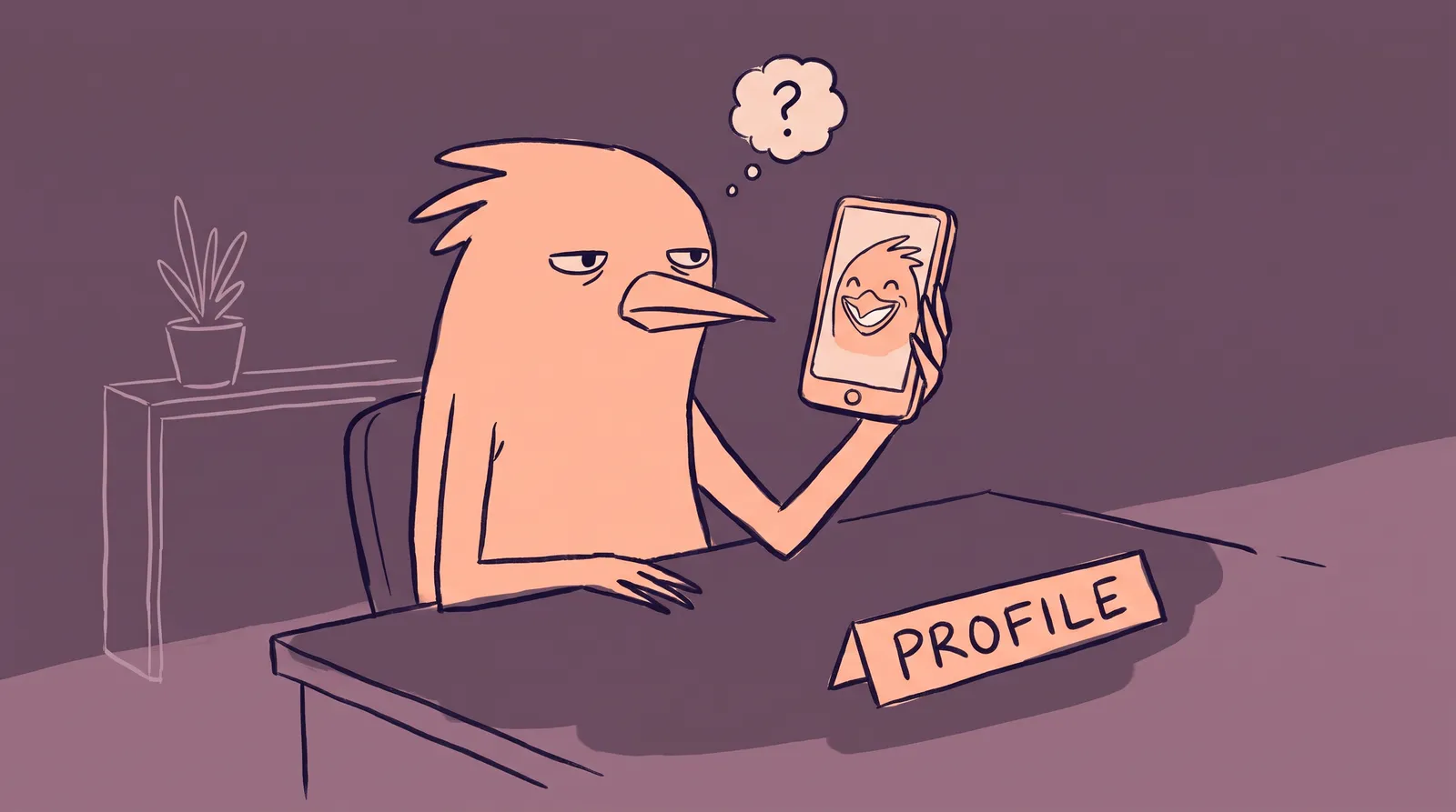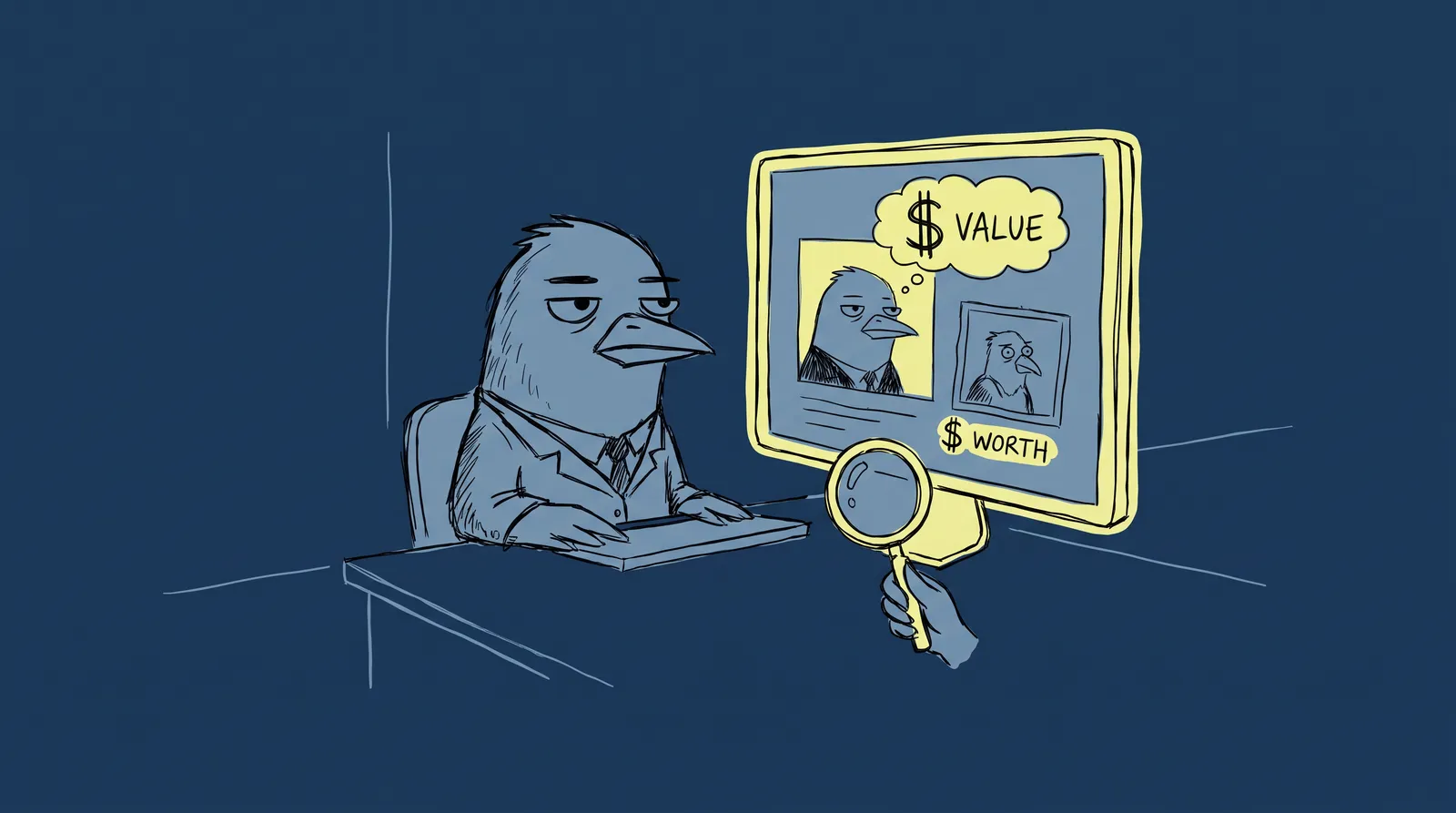
You find a developer on GitHub whose README is sharp and professional. You click through to their Twitter profile and see the same clean headshot, the same color palette, a bio that echoes the same positioning. You land on their personal site and it all feels like one brand. You instantly trust them more than someone with a pixelated selfie on LinkedIn and a cartoon avatar on GitHub.
None of that is accidental. LinkedIn's own data puts profiles with professional photos at up to 21x more views and 9x more connection requests. What most people get wrong is assuming that kind of consistency needs a designer or an agency behind it.
It doesn't, and what follows is how to build a unified visual identity across four platforms for free or close to it, in a weekend. It works the same whether you're a freelancer, developer, founder or career-switcher investing in a personal brand.
Why visual consistency matters more than you think
There's a well-documented psychological principle called the mere exposure effect. The more someone encounters a familiar visual, the more they trust it. When your headshot, colors, and tone match across platforms, you create subconscious recognition that compounds every time someone sees your name.
This matters because people check multiple platforms before reaching out. Recruiters, clients, and collaborators routinely scan two or three profiles before sending a message. First impressions form fast, often within seconds. If your LinkedIn looks polished but your Twitter feels like a different person entirely, that friction erodes trust.
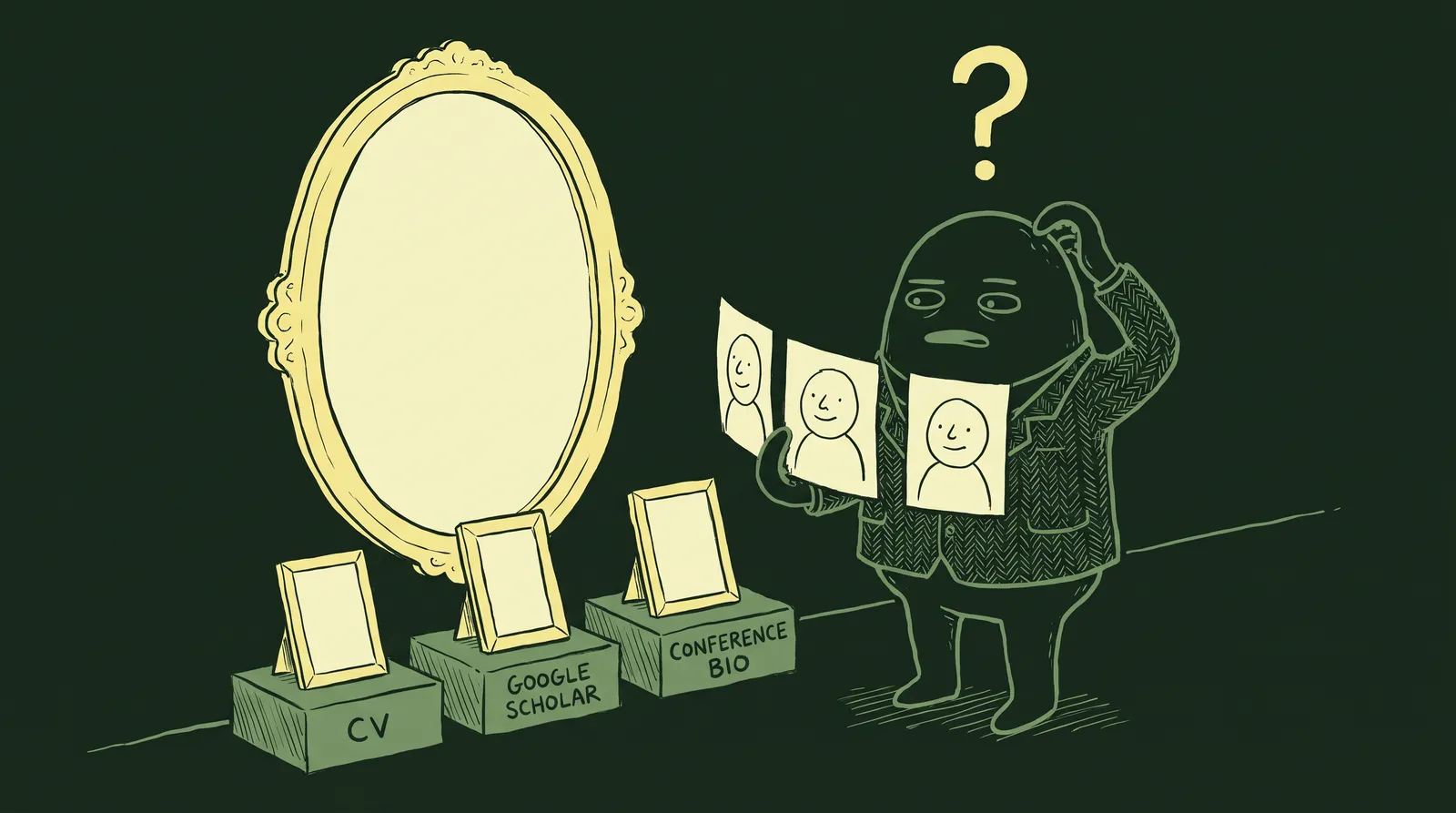
Consider two fictional personas. "Scattered Sam" uses a blurry conference photo on LinkedIn, a cartoon avatar on GitHub, a cropped group photo on Twitter, and has no personal site. Bios are inconsistent. Colors are random. "Branded Blake," on the other hand, uses the same professional headshot everywhere, a consistent three-color palette across banners, and bios that share a clear core message. Blake gets callbacks and inbound leads. Sam wonders why nobody responds.
The numbers back this up. Research shows that 79% of consumers in 2026 associate consistent visual branding directly with reliability. Consistent branding across platforms can increase revenue by 23% to 33%. And a signature color alone can boost brand recognition by up to 80%.
For an individual, a visual brand is not a logo. It is four things: a headshot, a color palette, consistent typography and a unified tone of voice.
Step 1: Your headshot is the anchor of everything
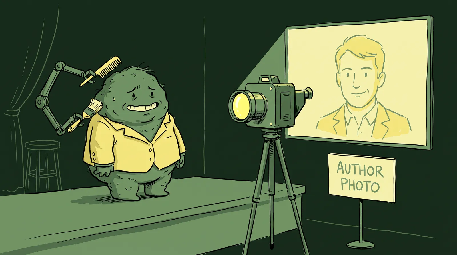
If you do only one thing from this guide, make it this: get a strong professional headshot.
Your headshot is the single element that appears on every platform. LinkedIn, Twitter/X, GitHub, your personal site's about page. It's your visual constant. And it carries enormous weight. Profiles with professional headshots receive up to 36x more messages from recruiters. A genuine smile where teeth are visible increases perceived likability by 135%.
A good one comes down to five things. Keep the background clean, either a solid color or a soft gradient. Use natural light or well-diffused artificial light and avoid harsh shadows. Dress for your industry: a developer doesn't need a suit, but a wrinkled t-shirt won't do you any favors. Aim for a genuine expression, because a real smile beats a stiff pose every time. And upload at 1000x1000px or higher, since LinkedIn, Twitter and GitHub all compress, and starting sharp is the only way to stay sharp.
The traditional barrier here is cost. Professional headshot photography runs $150 to $500+, requires scheduling, travel, and wardrobe decisions. For remote workers, freelancers, or anyone on a budget, that's a real blocker.
AI headshot generators removed that barrier. You upload a few casual photos and get studio-quality results in minutes. Starkie AI is built for this specifically.
Generate two or three variations while you're there. Use a tighter crop for profile pictures on LinkedIn, Twitter and GitHub, and a wider crop for website hero sections or speaker bios. What matters is that the same photo or session shows up everywhere.

Step 2: Choose a simple color palette (3 colors, 15 minutes)
Your headshot creates visual consistency through your face. Your color palette creates it through everything else: banners, website backgrounds, link buttons, social graphics.
Consumers are 81% more likely to recall a brand's signature color than the brand's actual name. That's how powerful color is.
The fast method is three picks: one primary color you're naturally drawn to, one neutral (white, charcoal or navy), and one accent that contrasts well with the primary. Coolors.co, Realtime Colors and Adobe Color all generate and preview palettes in seconds.
If you'd rather not decide from scratch, use an eyedropper to pull colors out of your headshot's background or outfit. That gives you harmony between your photo and your palette without any color theory.
Three palettes you can copy directly: a clean technologist look at #1A1A2E / #16213E / #0F3460, a warm creative one at #F4E0AF / #E07C24 / #2D2D2D, and a minimal builder set at #FFFFFF / #333333 / #4A90D9.
One last thing: save your hex codes somewhere accessible, a Notes app, a Notion doc, a pinned Slack message to yourself. You'll reference them repeatedly over the next few hours.
Step 3: Design platform banners and headers with free tools
Banners and headers are the most underused personal branding real estate on the internet. Most people leave them as defaults or slap on a generic stock photo. This is a missed opportunity.
Here are the exact dimensions you need in 2026:
| Platform | Banner/Header Size | Notes |
|---|---|---|
| 1584 x 396px | Keep key content centered | |
| Twitter/X | 1500 x 500px | Profile pic overlaps bottom-left on desktop |
| GitHub README | 1280 x 320px | Custom creation recommended |
| Personal Site Hero | 1920 x 1080px | Keep file size under 600KB |
The 20-minute workflow, using Canva's free tier:
- Start with a LinkedIn banner template.
- Set your primary color as the background.
- Add your name and title in a clean sans-serif font.
- Optionally include a subtle tagline or one piece of social proof ("500+ GitHub stars" or "Featured in TechCrunch").
- Duplicate the design and resize it for Twitter, GitHub, and your website hero.
That's it. One design, adapted four times. Same layout, same colors, same font. Consistency without repetitive work.
If Canva isn't your style, try Figma (free tier, great for developers who want more control), Photopea (a free Photoshop alternative that runs entirely in your browser), or even Google Slides exported as images.

Don't overload the banners. People process them in a second or two, so keep the design readable at a glance.
Step 4: Write bios that feel like one person
Visual consistency without verbal consistency still feels off. Your bios need to share a common "core identity statement," adapted for each platform's culture and character limits.
Start with a master bio: two or three sentences on who you are, what you do and who you help. Then adapt it. LinkedIn wants something longer, more formal and keyword-rich for search. Twitter/X wants 160 punchy characters with the personality up front. GitHub wants technical and project-focused, with links out to your other profiles. Your personal site gets the full narrative.
Here's how that plays out for Priya, a fictional full-stack developer.
Master bio: "Full-stack developer building tools that simplify complex workflows. I specialize in React and Node.js, helping startups ship faster with cleaner architecture."
LinkedIn: "Full-stack developer specializing in React and Node.js. I build tools that simplify complex workflows, helping early-stage startups ship production-ready products faster with cleaner architecture. Previously at Stripe. Open to consulting."
Twitter/X: "Full-stack dev building tools that simplify complex workflows. React + Node. Shipping fast, shipping clean."
GitHub: "👋 Full-stack developer | React & Node.js | Building tools that simplify complex workflows. Check out my latest projects below."
Personal site: A full about page expanding on Priya's background, philosophy, and the projects she's most proud of.
Notice the thread: "building tools that simplify complex workflows" appears in every version. That phrase becomes Priya's signature, a piece of subconscious pattern recognition that ties everything together. When someone sees the same face and similar language across platforms, trust compounds.
Case study: Building a cohesive brand in one weekend
Jordan is a career-switching UX designer entering the tech job market in May 2026. They have no professional headshot, a bare LinkedIn profile, a dormant Twitter account, a GitHub with a few projects, and no personal site.
On Saturday morning, Jordan uploads five casual photos to Starkie AI and generates three professional headshot variations in under ten minutes. They pick a primary headshot (tight crop for profiles) and a wider variation for their website.
On Saturday afternoon, Jordan opens Coolors.co and extracts a three-color palette from the headshot's background tones: a deep teal, off-white, and warm charcoal. They open Canva, create a LinkedIn banner with their name, title ("UX Designer | Making Complex Products Feel Simple"), and the teal-to-charcoal color scheme. They duplicate and resize for Twitter and GitHub. Total time: about 30 minutes.
Then Jordan writes a master bio and creates four platform-specific variations, reusing the phrase "making complex products feel simple" in each one.
On Sunday, Jordan sets up a simple personal site using Carrd (free tier). They apply the same color palette, upload the headshot and banner, paste in the full bio, and link to all their profiles. Total cost: under $30 for the AI headshots plus a free site template.

In 48 hours, Jordan goes from scattered to cohesive. Their profiles look like they belong to someone who takes their career seriously. Every platform reinforces the same message and the same visual identity.
Platform-specific tips and dimension cheat sheet
A quick reference for each platform.
- Upload your headshot at 1000x1000px for best quality (400x400px minimum).
- Use your branded banner. Make sure your headline mirrors your bio's core positioning.
- Consider enabling Creator Mode. It changes your default button from "Connect" to "Follow," highlights topics under your headline, and surfaces your content higher on your profile.
Twitter/X
- Profile photos display as a circle. Make sure your headshot looks good when cropped circularly, with your face taking up roughly 60% of the frame.
- Keep your banner clean. Avoid placing text near the bottom-left where your profile pic overlaps on desktop.
- Pin a tweet that reinforces your brand positioning.
GitHub
- Create a profile README (the "special repository" trick: make a repo with the same name as your username). Include your headshot, a brief intro, and links to your other platforms.
- Use your brand colors in any badges or shields.io elements.
- Your contribution graph is part of your visual brand. Keep it active.
Personal Site
- This is where everything comes together. Place your headshot above the fold.
- Apply your color palette consistently: backgrounds, buttons, links, accents.
- Use the same fonts from your banners.
- Link back to all your other profiles prominently.
Quick Reference Cheat Sheet:
| Platform | Profile Photo | Banner/Header | Bio Limit | Key Tip |
|---|---|---|---|---|
| 400x400px (1000x1000 rec.) | 1584x396px | 2,600 chars (About) | Enable Creator Mode | |
| Twitter/X | 400x400px (circle crop) | 1500x500px | 160 chars | Pin a positioning tweet |
| GitHub | Profile README image | 1280x320px (README) | No hard limit | Use shields.io with brand colors |
| Personal Site | High-res, above the fold | 1920x1080px (hero) | Unlimited | Link to all other profiles |
Make them find the same person
Remember that developer from the opening? The one whose GitHub, Twitter and personal site all felt like one brand? They didn't hire an agency. They followed a system.
Visual branding isn't about perfection or expensive tools. It's consistency across a handful of elements: one strong headshot, one color palette, one design template adapted per platform, one core message.
The headshot is where to start, because it's the constant across every platform and the thing that triggers recognition before anyone reads a word. Generate a professional AI headshot, then build outward from there.
Your next client, recruiter or collaborator will check at least two of your profiles before they reach out. They should find the same person on both.