In 2026, there are over 73 million freelancers in the United States alone. That's a staggering number. And most of them are losing clients before they ever get a chance to pitch.
The reason isn't skill. It isn't pricing. It's that their visual presence screams "side hustle" instead of "serious professional."
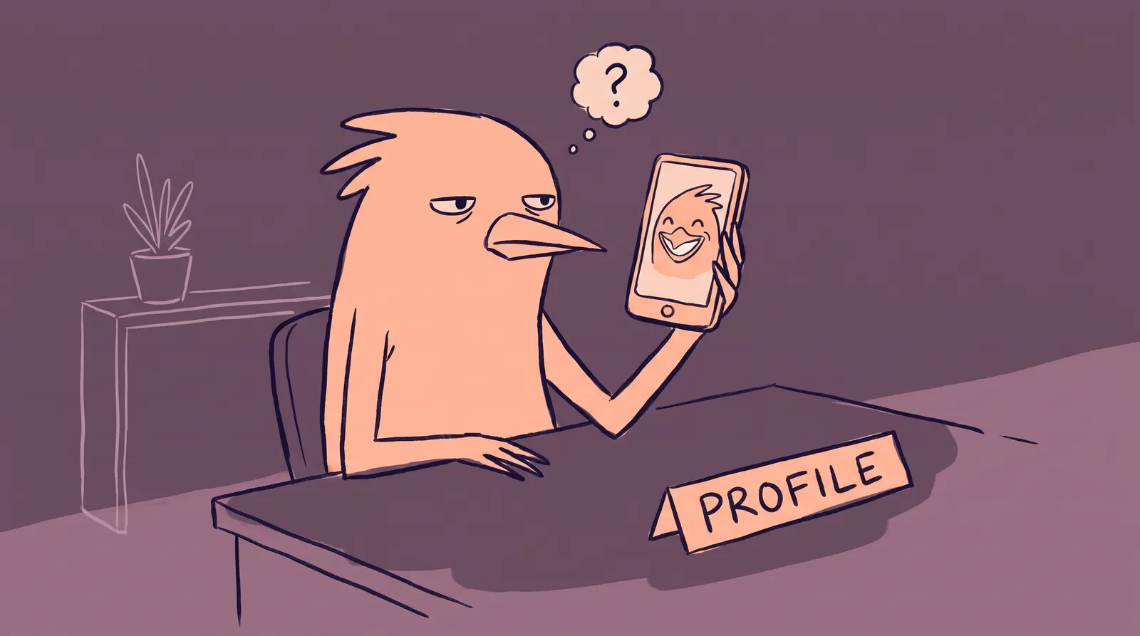
Call it the three-second scroll test. When a potential client lands on your profile or website, they judge your credibility in roughly three seconds, then decide whether you're worth a closer look or just another name in a very long list.
So how do you build a visual brand that looks like a legitimate company when it's you, your laptop and your cat?
What follows is a framework for a cohesive visual identity across every platform without hiring an agency: the five visual pillars, a platform-by-platform playbook, and before-and-after profile transformations showing what's possible in a weekend.
The credibility gap: Why visual branding isn't optional for freelancers anymore
The freelance market has never been more crowded. With roughly 73 to 76 million freelancers making up nearly 38% to 45% of the US workforce, clients have an overwhelming number of options. They need fast filtering mechanisms. And visual cues are the fastest filter available.
According to 2026 branding data, 55% of a brand's first impression is purely visual. Hiring managers and potential clients make split-second decisions based on visual trust. That means your profile photo, your banner image, and the overall polish of your online presence carry enormous weight before anyone reads a single word of your portfolio. Research on how profile photos influence hiring decisions confirms just how much weight these visual cues carry.
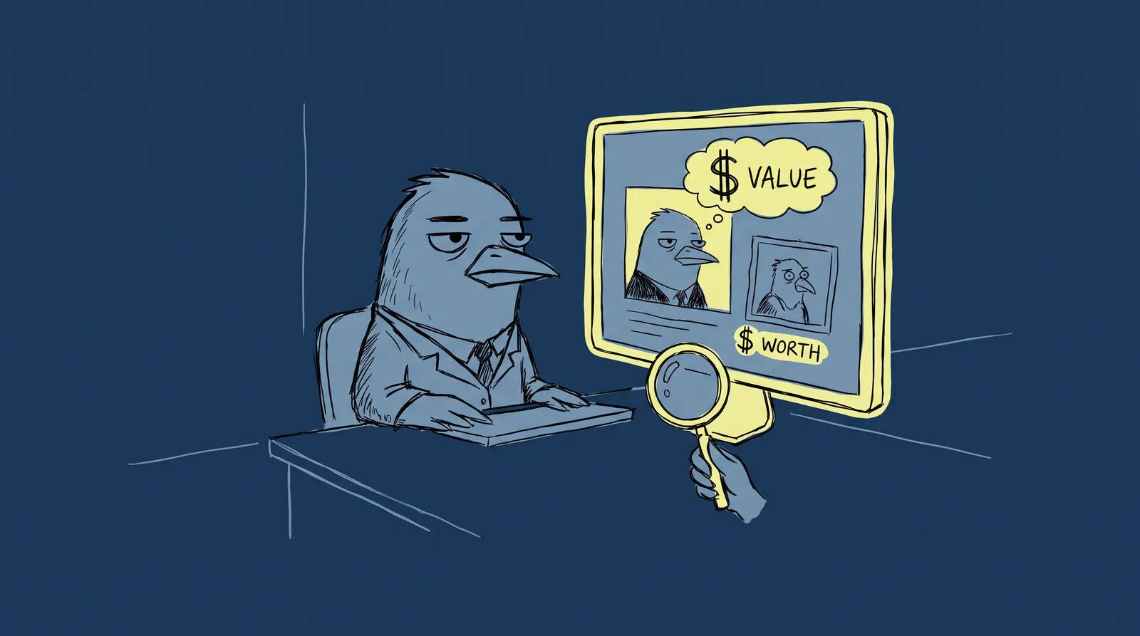
This creates a credibility gap: the disconnect between a freelancer's actual skill level and what their visual presence communicates. Many talented freelancers undersell themselves with inconsistent, low-quality visuals. A brilliant copywriter with a cropped vacation photo and a default LinkedIn banner looks indistinguishable from someone who started freelancing last Tuesday.
The data backs this up. Brands, one-person brands included, that keep visual consistency across platforms see an average revenue increase of 10% to 20%, and consistent branding lifts awareness and trust by roughly 30%.
Think of it this way: a restaurant with a handwritten cardboard sign gets fewer walk-ins than one with professional signage, even if the food is identical. Freelancers with polished visuals get more clicks, more inquiries, and higher-paying projects. Corporate clients and startups increasingly expect freelancers to present themselves with the same polish as agencies, complete with branded proposals, cohesive profiles, and professional imagery.
Closing that gap comes down to five things: your headshot, your color palette, your typography, your banner and cover images, and whether all of it stays consistent from platform to platform.
Pillar 1: Your professional headshot, the single highest-ROI investment
Your headshot is the one visual element that appears everywhere. LinkedIn. Upwork. Fiverr. Twitter/X. Your personal website. Email signatures. Proposals. Invoices. It's the cornerstone of your entire visual brand.
The numbers are not marginal. A professional headshot can produce 14x more LinkedIn profile views and a 76% higher perceived competence rating.
What makes one work comes down to four things. The background should be neutral and free of distraction, whether that's a studio-style backdrop or a simple office. The lighting should be even and soft; harsh shadows or dim webcam glow destroy credibility instantly. The expression should be confident and approachable, either a friendly smile or a composed direct gaze, the kind that makes a client think they'd trust you with the project. And the attire should be professional for your particular niche, in solid colors with minimal patterns.
The failures are just as predictable. Cropped vacation photos with someone's arm still draped over your shoulder. Photos from five years ago. Casual selfies with cluttered backgrounds, sunglasses or heavy filters.

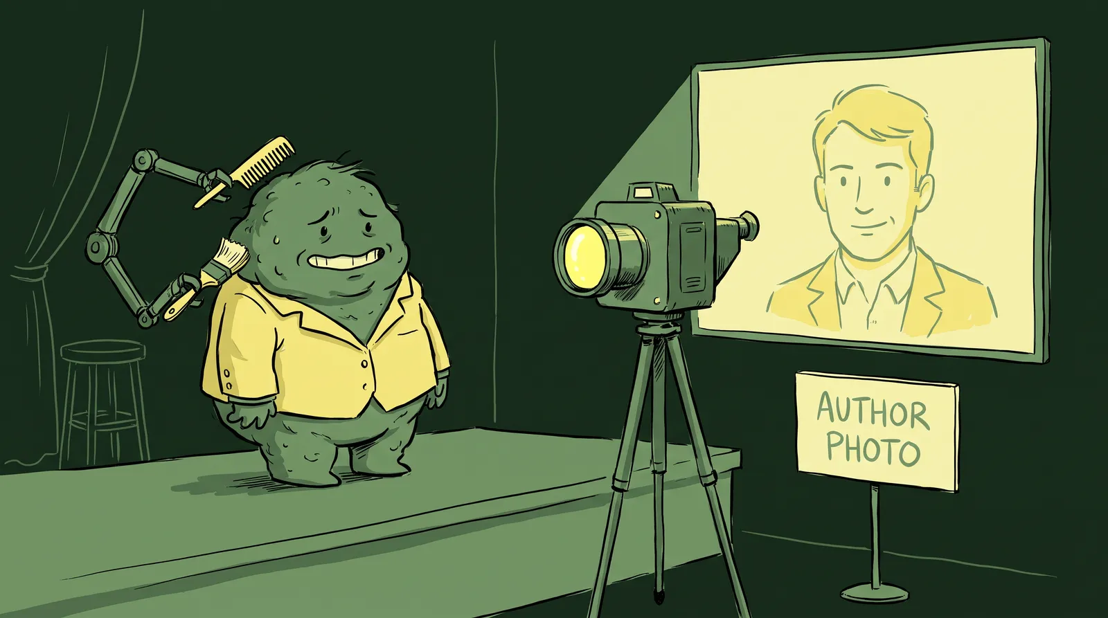
Traditionally, fixing this meant booking a professional photographer at $300 to $800 per session, plus scheduling, outfit planning, and travel. That's a real barrier for freelancers watching every dollar. You can learn more about what photographers typically charge in our professional headshot cost guide.
In 2026, AI headshot generators have changed the equation entirely. You can upload a few casual photos and receive studio-quality professional headshots in minutes for a median cost of $25 to $35. And 89% of recruiters now accept AI-generated headshots as long as they look authentic and professional. Tools like Starkie AI let freelancers generate multiple headshot styles (corporate, creative, approachable) so you can tailor your photo to different platforms without booking multiple sessions.
Create two or three variations rather than one: a polished corporate version for LinkedIn and proposals, a more relaxed creative version for your website and social media, and a friendly one for freelance marketplaces. That keeps you consistent while matching the tone of each platform.
Pillar 2: Choosing your color palette and typography (without a design degree)
Most freelancers never ask themselves what their brand colors are.
It sounds like an agency question, but a consistent palette creates instant recognition across every touchpoint. When a client reads your proposal, visits your LinkedIn and then checks your website, matching colors quietly signal that you have your act together. Research puts the effect on brand recognition at up to 80%.
You don't need a design degree to pick great colors. You need a simple system.
The 60-30-10 rule
Sixty percent goes to your dominant color, which is your background or surface: usually a neutral like white, light gray or dark charcoal. Thirty percent goes to your secondary, the actual brand color, used for larger elements, cards and section backgrounds. The last ten percent is your accent, saved for buttons, calls to action and anything that needs to grab attention.
Picking your colors
Use Coolors.co, which lets you generate palettes quickly and lock the colors you like, or Adobe Color. Start with one primary color that suits your niche. A UX consultant or tech freelancer is well served by a calming blue or deep teal, which read as trust and stability. A marketing strategist or creative director can go bold orange against charcoal for energy. A financial consultant wants muted blue with gray and gold, which reads as precision. A wellness coach wants soft greens and warm neutrals.
Typography made simple
Choose one heading font and one body font, and stop there. Consistency matters more than creativity. Two free Google Fonts pairings that hold up: Poppins with Inter, which is clean and modern enough for nearly any niche, and Playfair Display with Source Sans Pro, which gives you elegant headings over readable body text and suits consultants and writers.
Build your mini brand kit
Create a single-page reference document (even a free Canva file) that stores your hex codes, font choices, headshot variations, and logo or wordmark. This becomes the single source of truth for every visual asset you create. Every proposal, every social post, every banner image pulls from this one document.

A Mini Brand Kit takes about an hour to assemble. It saves you hundreds of hours of second-guessing design decisions down the road.
Pillar 3: Banner images, cover photos, and the visual real estate you're ignoring
Most freelancers spend some time on their headshot, then completely ignore the banner images on LinkedIn, Twitter/X, Upwork portfolio headers, and website hero sections. This is prime visual real estate, and leaving it as a default background or a random stock photo actively damages your credibility. A generic default banner "can signal a lack of effort and hurt credibility."
Platform dimensions you need to know
A LinkedIn personal banner is 1584 x 396 pixels, a 4:1 ratio, and you want the important text and visuals in the middle 60% because mobile crops the edges. A Twitter/X header is 1500 x 500 with the same centering rule. A website hero varies by platform, but 1920 x 1080 or a similar widescreen size works.
What your banner should communicate
Your banner has to answer one question at a glance: what does this person do, and why should I care?
Include your value proposition, key services, or a notable client testimonial. If you've worked with recognizable brands, a tasteful row of client logos builds instant credibility. A freelance copywriter's LinkedIn banner might read something like "Conversion Copy for SaaS Companies" alongside her brand colors and a subtle headshot element.
How the system works together
When your headshot, color palette, and banner all draw from the same Mini Brand Kit, the effect is dramatic. A freelancer's LinkedIn profile with a matching headshot, on-brand banner, and consistent color accents in their featured section looks like a polished professional operation. One with mismatched elements looks like an afterthought.
Spend an hour in Canva's free tier creating a set of platform-matched banners. Use your Mini Brand Kit colors and one of your AI-generated headshots as a design element. Canva has thousands of customizable templates, and you can input your exact hex codes for perfect color consistency.
Before and after: Real freelancer profile transformations that won more clients
Let's look at three composite case studies based on common freelancer archetypes. These aren't hypothetical. They're based on the kinds of visual upgrades that research shows can reduce website bounce rates by 28% and increase repurchase rates by 60% for brands with clear visual cues.
Case study 1: The freelance copywriter
She started with a cropped group photo from a friend's wedding, a default LinkedIn banner and no consistency anywhere. The portfolio was strong; the inbound inquiries were nearly nonexistent.
She generated a polished AI headshot with a warm expression, designed a branded LinkedIn banner carrying her tagline ("Conversion Copy That Pays for Itself") in navy and coral, and matched those colors across her website, email signature and proposal templates. Inbound inquiries tripled within two months.
Case study 2: The freelance web developer
He had a dimly lit webcam selfie on Upwork and a bare-bones profile with portfolio screenshots in random sizes and no framing. Talented, with a frustratingly low proposal acceptance rate.
He switched to a professional AI headshot with clean lighting, reframed every portfolio screenshot with consistent borders and a brand color overlay, and added a branded cover image. His acceptance rate went up, and he raised his rates by 40%.
Case study 3: The solopreneur consultant
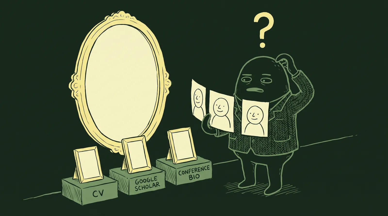
She had a different photo on every platform: a three-year-old LinkedIn headshot, something else entirely on her website, nothing in her email signature. Clients on calls sometimes didn't recognize her from her profiles.
One AI headshot session gave her matching photos everywhere. She built a brand kit with two colors and one font pairing and applied it across the board. Clients started describing her as a boutique consulting firm rather than a solo operator, and the shift happened almost immediately.

Every one of these upgrades was a single weekend's work for under $50, and the change in how clients perceived them showed up fast.
The platform-by-platform playbook: Applying your visual brand everywhere
Having a great brand kit is useless if you only apply it to one platform. Clients cross-reference you. They'll check your LinkedIn, then your website, then your Upwork profile. Visual consistency across all of these builds compound trust over time. For a deeper dive on building a cohesive online presence, check out our remote worker guide to a cohesive digital presence.
LinkedIn (your visual home base)
LinkedIn is often the first place clients check for validation. Treat it accordingly.
- Professional headshot (corporate or polished creative style)
- Custom banner with your value proposition and brand colors
- Featured section thumbnails designed in your brand palette
- Custom URL (linkedin.com/in/yourname)
Upwork, Fiverr, and freelance marketplaces
- Approachable-style headshot (friendly expression, clear face)
- Portfolio images with consistent framing and color overlays
- Service description graphics with your brand elements
- Note: marketplace algorithms may favor profiles with complete, professional imagery
Personal website or portfolio
- Hero section featuring your headshot and a clear value proposition
- Consistent color palette throughout every page
- Testimonial section with client photos or logos
- Branded case study layouts
- Affordable tools to consider: Carrd, Framer, or WordPress
Email signatures and proposals
- Include your headshot, brand colors, and a clean layout
- Tools like WiseStamp or HubSpot's free email signature generator make this quick
- For proposals, use branded Google Docs or Canva templates
Social media (Twitter/X, Instagram, Threads)
- Matching profile photos across all platforms
- Branded post templates for sharing insights or case studies
- Consistent visual tone in every piece of content you share
Match your visual brand to your niche, because a developer shouldn't look like a life coach
Professional visual identity is not one-size-fits-all. The signals that communicate "trustworthy expert" vary dramatically by freelance niche, and mismatched visuals undermine your positioning even when your work speaks for itself.
Three archetypes, three visual languages
The full-stack developer wants a clean dark or neutral background (grays and tech-associated tones). Minimal clothing detail. A slight forward lean that signals precision and focus. The visual identity here is reductionist: simple, clean, and instantly readable at small sizes.
The brand copywriter wants warmer background tones and a genuine smile. Perhaps a hint of personality through color or an environmental element. This signals creativity and approachability, the exact qualities a client hiring a copywriter wants to feel.
The independent business consultant wants a structured blazer and a confident, direct gaze. A muted professional palette built around blues and grays, colors that communicate confidence and clarity. The overall signal: authority and ROI.
The expression variable
Micro-expression choices send powerful subconscious signals. A direct gaze with a neutral mouth reads as "authority." A slight smile with relaxed eyes reads as "collaborator." An animated expression with a tilted head reads as "creative." These aren't random. Choose your expression deliberately based on the archetype you want to project.
Color psychology in backgrounds
Your background color is doing work whether you chose it or not. Cool neutrals like gray, slate and charcoal suit tech, finance and data-driven niches. Warm neutrals such as cream, warm white and soft wood tones suit creative, coaching and wellness work. Bold accent colors belong to brand-forward creatives who deliberately want to break their category's norms.

A quick exercise
Open Google right now and search for your top three competitors on Upwork or LinkedIn. Notice the visual patterns. What backgrounds do they use? What's their expression? What's the overall color temperature? Now look at your own photo. Does it fit the pattern, or does it break it? If it breaks it, is that intentional, or accidental?
The seasonal refresh workflow: Stay current without starting over
Most freelancers fall into one of two traps. They either never update their photos (leading to a jarring mismatch when clients meet them on video) or they feel paralyzed by the perceived cost and effort of a full photoshoot. Both extremes hurt.
Here's a sobering stat: 56% of professionals have met someone in person who looked significantly different from their headshot. And half of LinkedIn users have been using the same profile photo for three to six years or longer. That mismatch erodes trust before a single word is spoken.
The quarterly visual audit
Set aside 15 minutes every three months. Open all your active profiles. Ask yourself three questions:
- Does my headshot still look like me?
- Does it still match my current positioning and niche?
- Is it consistent across all platforms?
If you answer "no" to any of these, it's time for an update.
The 3-trigger rule
You need a refresh when any one of three things happens: your appearance changes significantly (new hairstyle, glasses, noticeable weight change), your niche or positioning shifts (generalist to specialist, or a change of industry), or 18 months pass since the last update. One is enough.
Making refreshes painless
Traditional photoshoots cost $150 to $500+ and require scheduling, travel, wardrobe planning, and editing turnaround. That's a real barrier for cost-conscious freelancers, especially when you need to refresh every 12 to 18 months.
AI headshot tools like Starkie AI collapse that barrier to nearly zero. You can generate a fresh, professional headshot in minutes from home, making seasonal updates something you actually do rather than something you keep meaning to get around to.

Your weekend visual rebrand: The step-by-step action plan
That's a lot of ground, but it fits into one focused weekend.
Saturday morning (30 minutes)
Generate three to five professional headshot options using Starkie AI. Upload a few casual photos and select styles that match your platforms: corporate for LinkedIn, creative for your website, approachable for marketplaces. This takes about 15 to 30 minutes total. Browse our headshot style packs to find the right look for your niche.
Saturday afternoon (1 to 2 hours)
Build your Mini Brand Kit. Open Canva (free tier works fine). Choose your two to three brand colors using Coolors.co. Pick your font pairing from Google Fonts. Save your hex codes, fonts, and headshot variations in one reference document. Done.
Saturday evening or Sunday morning (1 to 2 hours)
Design your platform banners and cover images in Canva using your brand kit. Start with LinkedIn (1584 x 396), then adapt the same design for Twitter/X (1500 x 500) and your website hero section. Use your headshot as a design element where appropriate.
Sunday afternoon (1 to 2 hours)
Update everything. LinkedIn. Upwork or Fiverr. Your personal website. Email signature. Social media accounts. Ensure your headshot, colors, and banners are consistent across every single platform.
Total investment
Approximately four to six hours of focused work and under $50, primarily for AI headshots and optionally a month of Canva Pro. Compare that to the $2,000 to $5,000 or more an agency would charge for a brand identity package.
None of this is set-and-forget. Put a 30-minute brand audit on the calendar each quarter to keep the platforms consistent, the photos current, and the visuals moving with your business.
Your visual brand is your competitive edge
In a market of 73 million freelancers, your visual brand decides whether you get scrolled past or shortlisted. The credibility gap is real, and it's cheap and fast to close.
None of it requires a design background or an agency budget. The headshot is the foundation and the easiest piece to solve today. The color palette is what ties the rest together. Consistency across platforms is what moves you from random freelancer to trusted professional in a client's head.
The highest-impact thing you can do in the next 15 minutes is generate a professional headshot with Starkie AI.