The most-booked portrait photographers on Instagram rarely have the sharpest technical skills. Look closely and you'll notice something else: they have the most recognizable editing style. A potential client scrolling through a photographer's portfolio decides within seconds whether the aesthetic "fits" them. That gut reaction isn't magic. It's the result of deliberate, repeatable color grading.
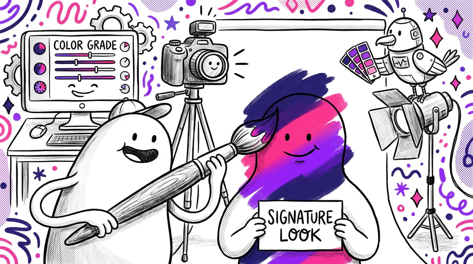
A signature look isn't just an artistic choice. It's a business asset. And in 2026, when visual noise is louder than ever and clients have more options than they can process, a consistent color grade is the single fastest way to stand out, build trust, and get booked.
What follows is a technique-driven roadmap for building that look from scratch: Lightroom, Capture One, the science of skin tones and the client strategy around it. It applies whether you shoot corporate headshots, actor portraits or personal branding sessions.
Why a signature color grade is your most underrated business tool
Most photographers overlook that consistent visuals work as a cognitive shortcut for the viewer. When your brand imagery is familiar and predictable, the brain processes it with less effort. Psychologists call this "processing fluency," and it triggers a subconscious sense of safety, comfort, and reliability. According to branding research, consistent brand presentation can increase revenue by up to 23%.
Now think about what that means for a portrait photographer's portfolio. Twelve images with a unified grade read as professional authority. Twelve technically strong but tonally inconsistent images read as uncertainty. Clients searching for a headshot photographer shortlist based on "feel" before they ever read a bio or check pricing. Your color grade is doing silent selling.
The 2026 creator economy reinforces this. The lines between "creator" and "entrepreneur" have blurred, and audiences crave credible, memorable visual identity over fleeting virality. As creator economy analysis shows, strategic, high-quality visual identity is now a top imperative for anyone building a personal brand.
And there's a practical bonus: a consistent grade reduces your post-production time per shoot, improves client satisfaction by setting accurate expectations, and strengthens referral language. "You need to book her, I love that warm, clean look she gives everyone" is infinitely more powerful than "she takes good photos."
Before you can build a signature look, though, you need to understand what you're actually controlling.
The foundations: What color grading actually controls (and why skin tones are sacred)
Every color grade touches three levers: luminance (brightness relationships), hue (color identity), and saturation (color intensity). In portrait work, these aren't abstract concepts. They determine whether your subject's skin looks healthy and radiant or flat and lifeless.
And skin tones are the non-negotiable anchor of any portrait grade. The human eye is neurologically calibrated to detect "wrong" skin before anything else in a frame. Skin is biologically complex, with varying levels of melanin, hemoglobin, and carotene creating a range that no single filter handles well. As CaptureNoire's research highlights, mainstream "one-size-fits-all" filters have historically struggled with melanin-rich skin tones, often making them look ashy or desaturated.
Here's a handy rule of thumb: when you sample a medium-tone area of skin in Lightroom's histogram, Red should be the highest RGB value, Blue the lowest, and Green in the middle. If that relationship breaks, something is off.
The most common beginner mistake? Applying cinematic grades developed for landscape or street work, think heavy teal shadows and crushed blacks, directly onto portrait work. It almost always makes skin look gray, greenish, or "sick."

The solution is what I call "grading within guardrails." Build a signature look that has creative latitude while keeping skin tones within a flattering, consistent range. Creative expression and skin accuracy aren't opposites. They're partners.
Mastering your tools: HSL panels, split toning, and the Lightroom vs. Capture One debate
Let's get specific. The HSL panel is where portrait color grading lives, and the Targeted Adjustment Tool (TAT) is its most underrated feature. Skin tones are complex. They often fall between defined color channels. Instead of guessing which slider to move, TAT lets you click directly on the skin and drag, allowing Lightroom to determine the precise blend of orange and red channels to adjust. Fstoppers' June 2026 analysis calls it "the underrated MVP" of portrait editing.
One thing to watch: the standard Adobe Color profile can produce a greenish-orange cast on skin. Some experts describe it as an "Oompa Loompa" tone. The fix is nudging orange and red hues slightly toward red-pink, and pulling back orange saturation for a subtler, more natural result.
Luminance works as a skin softener, which is worth knowing. Gently lifting the orange luminance channel creates a subtle, natural-looking glow that clients perceive as beautiful skin, without heavy retouching. Clients describe the effect as "flawless" and "creamy," and it takes seconds to apply.
For the Color Grading panel (formerly Split Toning), a reliable portrait formula is this: assign a warm amber/gold tone to midtones and shadows, then keep highlights neutral or barely cool. This "warmth in the shadows, clean in the light" approach creates the classic editorial portrait look that photographs well across diverse skin tones.
Capture One handles this differently. Its Color Editor offers skin tone range selection with feathering that is more surgical for headshot work. If you run a high-volume headshot studio, Capture One's precision is hard to beat. That said, both tools can achieve excellent results. Choose based on your workflow volume and comfort level.
One more hidden gem: Lightroom's Calibration panel. Adjusting the Red Primary hue slider slightly toward orange and lifting the Blue Primary saturation slightly can form the hidden foundation of a warm, film-adjacent signature grade, and this happens before HSL even enters the picture.
Case study: Building one signature grade from zero
Let's walk through a real scenario. You're shooting a corporate headshot session. Mixed lighting: window light plus an overhead LED panel. Your subjects range from fair to deep brown skin tones. These are the exact conditions that stress-test a grade.
Step 1: Establish your baseline. Use a gray card or the subject's white shirt as a white balance reference. This "resets" the image to a neutral truth before you make any creative decisions. As Kayleigh June's guide on Fstoppers explains, presets adapt differently based on original lighting. A neutral baseline ensures your creative grading applies consistently.
Step 2: Apply the foundation grade. Make your Calibration panel tweak (Red Primary hue toward orange). Lift shadows to around 10-15, which creates approachability without losing contrast. Pull highlights to -20 to retain detail in bright backgrounds or light skin.
Step 3: HSL refinement. Here are the specific moves: warm the Orange hue slider (+8 to +12), nudge Red hue toward orange (+5), and lift Orange luminance (+10 to +18). For deeper skin tones, reduce the luminance lift slightly to avoid over-brightening, which can wash out rich complexion detail.
Step 4: Color Grading panel. Assign a subtle warm amber to shadows (hue around 35, saturation around 15). Leave highlights neutral or with a barely perceptible cool tint. This "warmth in the shadows, clean in the light" formula gives your images character while keeping skin believable.
Save this as a named preset. You've just built your signature grade.

Adapting your signature look: Corporate clients vs. creative clients
Every portrait photographer faces this tension: a law firm wants clean and authoritative, an actor wants dynamic and warm, but constantly reinventing your grade destroys the brand consistency that got you hired.
The solution is the "preset family" concept. Build one master signature grade, then create 2-3 child variants that trace back to the same visual DNA. Preset collections from brands like Signature Edits are engineered exactly this way, retaining a specific aesthetic while offering child variants for different scenarios.
Your "Corporate Clean" variant might have slightly cooler highlights, higher clarity, and more neutral shadows. Your "Creative Warm" variant could feature deeper shadow toning, more contrast, and a touch of lifted grain. Both should be unmistakably yours.

Here's a practical tip for group headshot sessions with varied complexions: use the deepest skin tone as the calibration anchor for shadow detail. If the darkest complexion retains beautiful shadow information and dimension, every lighter skin tone in the group will also look great.
When a client asks for "a different look," reframe your editing style as a feature. Point to your consistent portfolio. Explain that clients hire you for that look. Confidence in your style builds confidence in the client. It reduces edit requests, too.
Exporting, scaling, and future-proofing your preset ecosystem
A great grade is worthless if it doesn't travel. Here's the workflow most tutorials skip.
Export and back up properly. Lightroom presets should be exported as XMP files. For Capture One, back up your styles from the specific application support folders. On Mac: ~/Library/Application Support/Capture One/Styles. On Windows: C:\Users\[username]\AppData\Local\CaptureOne\Styles. Software upgrades frequently erase custom files, so manual backups are essential.
If you work across platforms, third-party converters like Picture Instruments' Preset Converter ($47) or Briz LUT Converter ($50) can translate basic adjustments between Lightroom and Capture One, though complex HSL adjustments may still need manual fine-tuning.
Build presets with floating exposure. The most portable ones lock in color, tone curve shape, and HSL values but leave exposure, white balance, and spot removal unset. This way, they apply non-destructively across varied shooting conditions.
Use AI tools as a complement. AI headshot platforms like Starkie AI can help photographers or their clients generate consistent, professional-quality headshots when a full shoot isn't logistically feasible. Think of it as a resource you can confidently recommend to clients who need additional headshots between sessions, not a competitor to fear.
Version-control your presets. Use naming conventions like SA_Portrait_CorporateClean_v3_Jun2026 and build a quarterly review habit. As camera sensors improve and client aesthetics evolve, your grade should be a living document.
Finally, try this portfolio audit: import your last 30 delivered portraits, strip star ratings, and view them as a contact sheet. If you can't immediately see the family resemblance in the color, it's time to tighten the grade.
Your color grade is your creative signature
The most-booked photographers aren't always the most technically gifted. They're the most consistent. A signature color grade compounds: every portfolio image, every delivered gallery, every Instagram post reinforces the visual language clients learn to associate with your name.
That covers the whole path, from the science of skin tones through HSL and split toning, a worked case study, adapting for different client types, and systematizing the preset workflow.
As AI tools keep raising the baseline quality of headshot imagery available to clients, the photographers who do well won't be the ones resisting the shift. They'll be the ones whose style is distinct enough that clients come looking for it specifically.